Rebranding the largest retail association in the U.S.
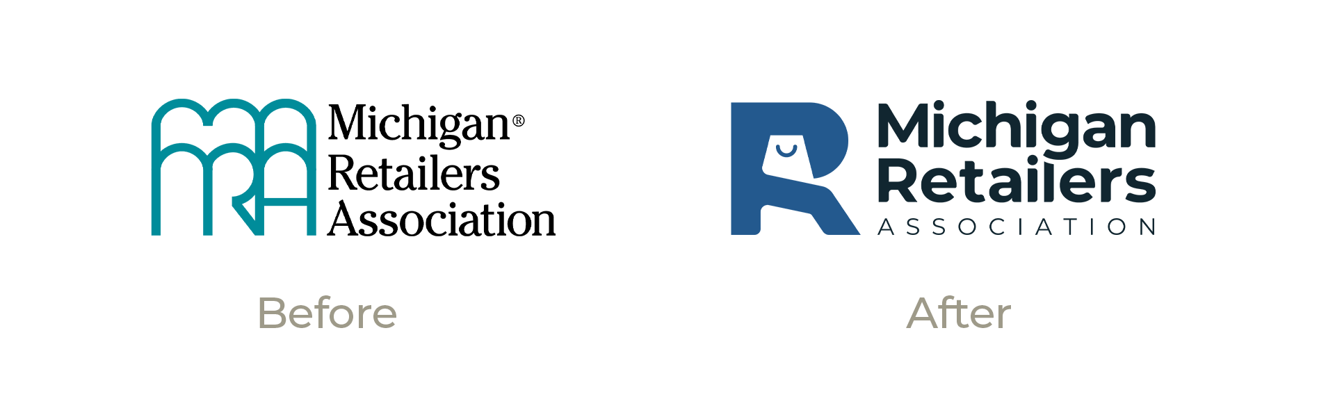

What's up
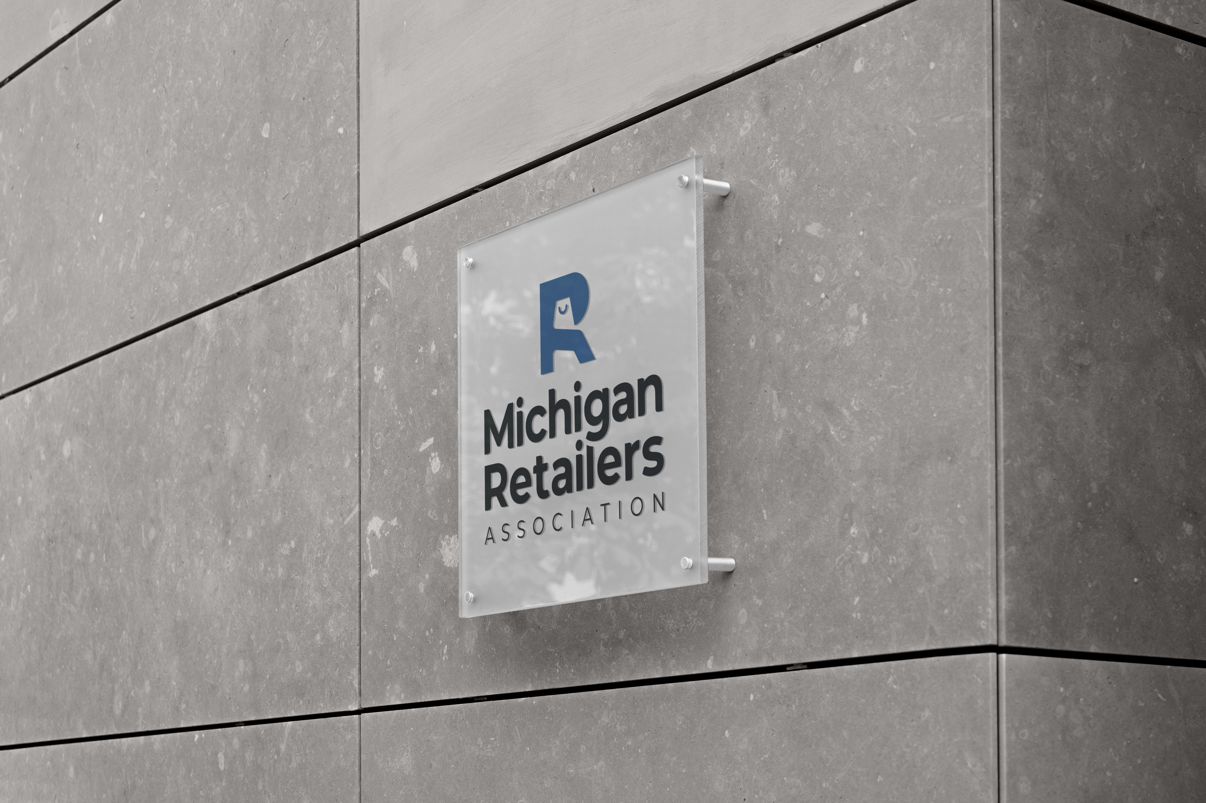
with the "R"?
with the "R"?
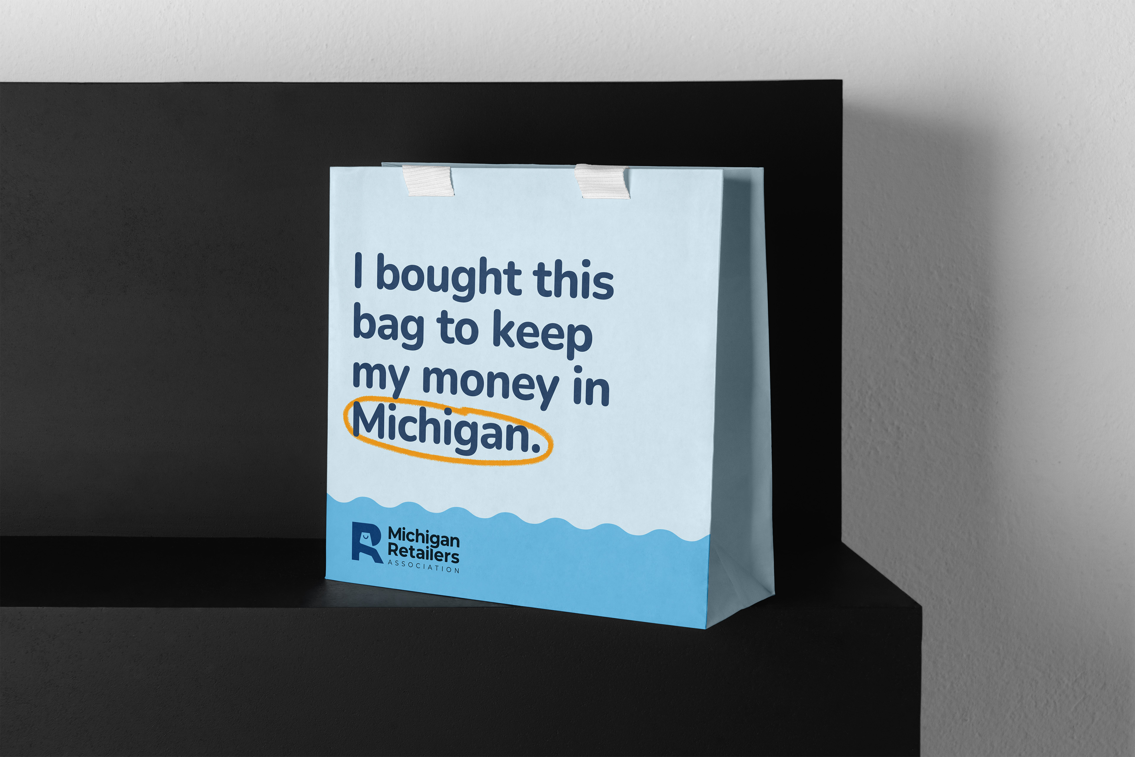
The handle of the bag doubles as a smile, highlighting the warmth and joy that MRA membership brings.
The mixture of curves and sharp corners speaks to what MRA is – a friend to businesses of all kinds and a fierce defender of Michigan's retail industry.

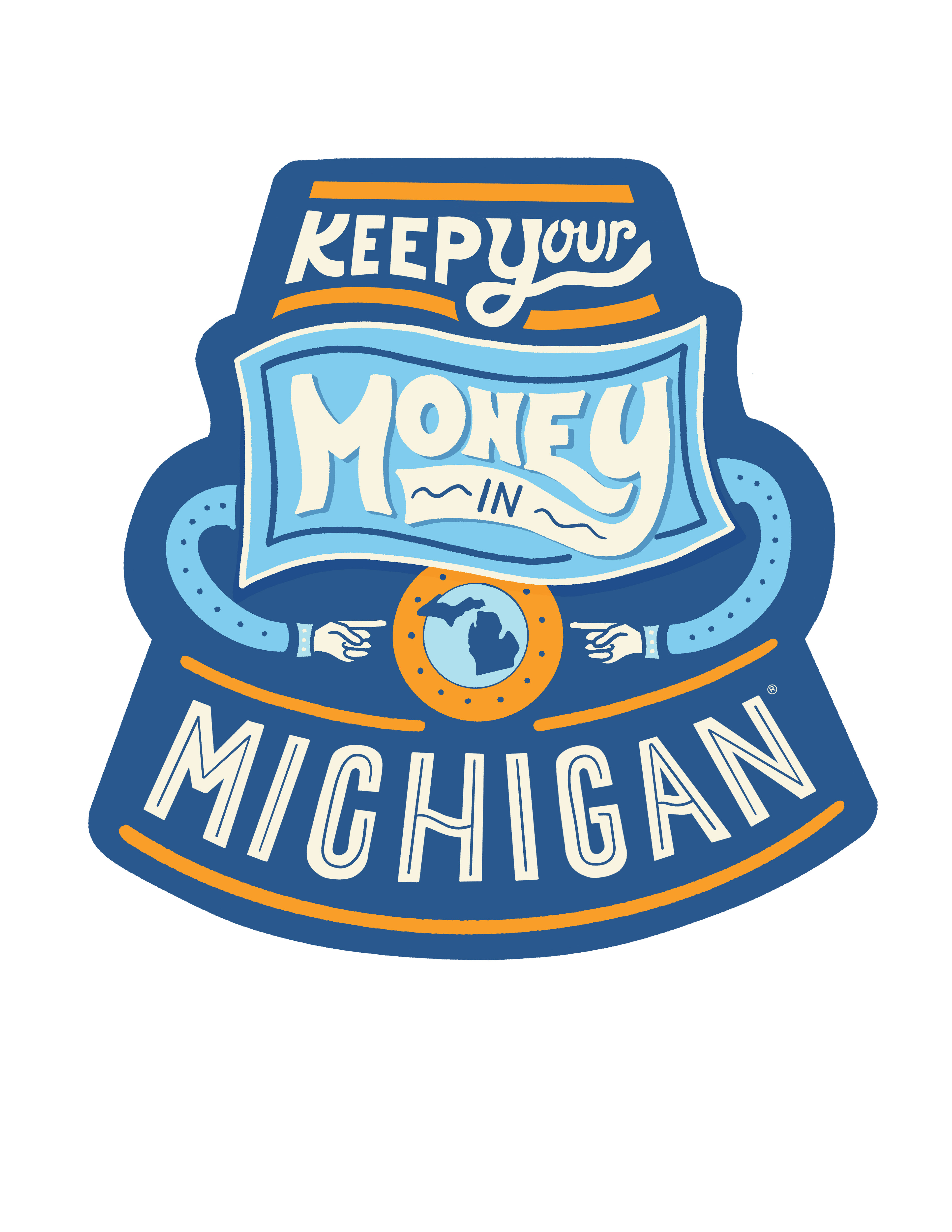
Shopping bag in the negative space

The handle of the bag doubles as a smile

Mixture of curves and corners shows approachability and professionalism
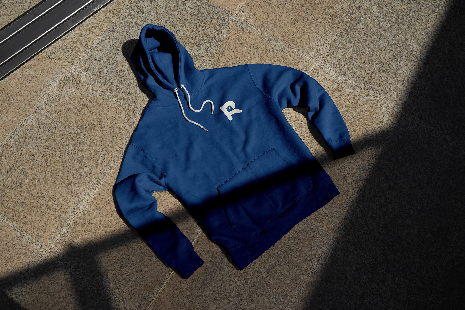
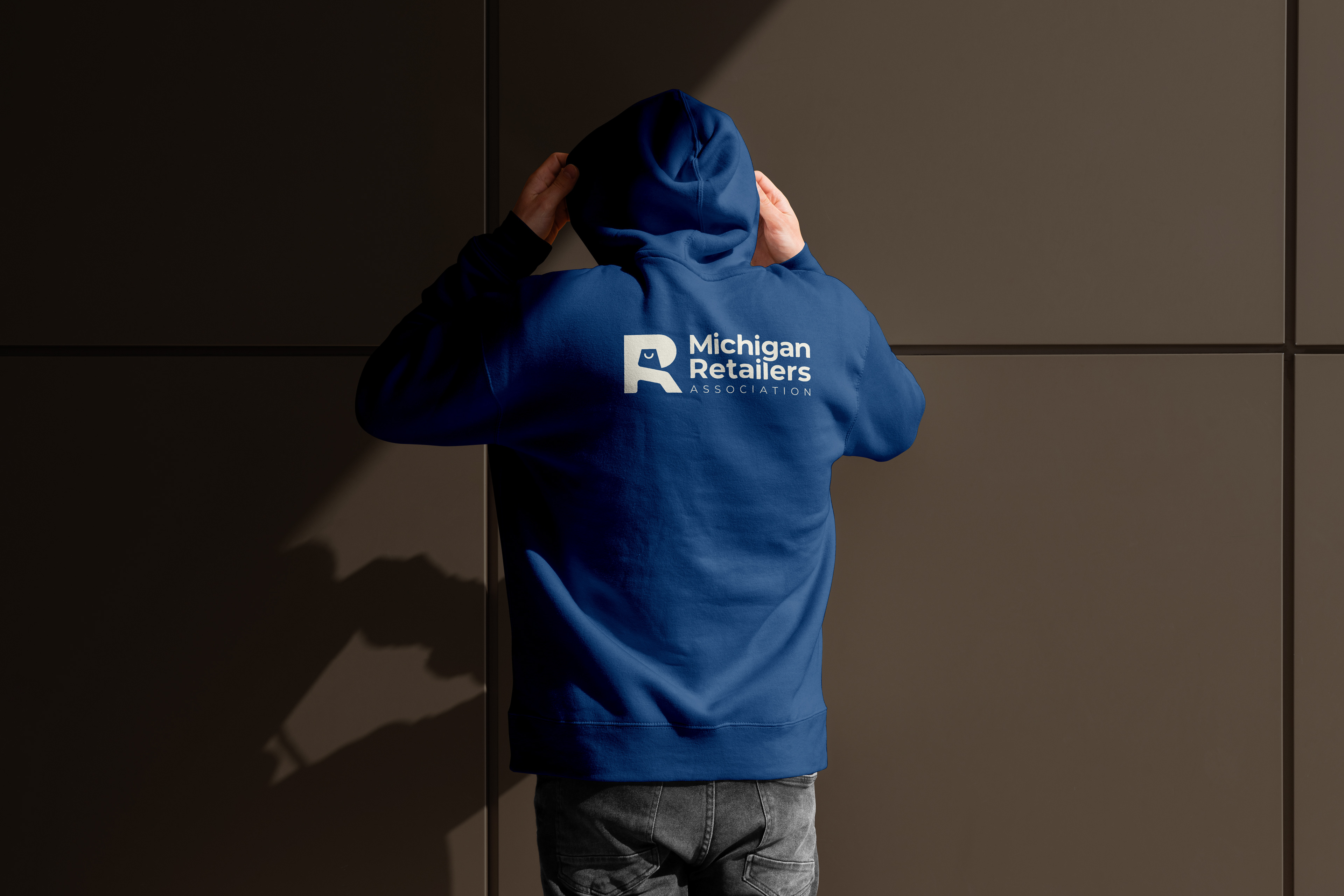
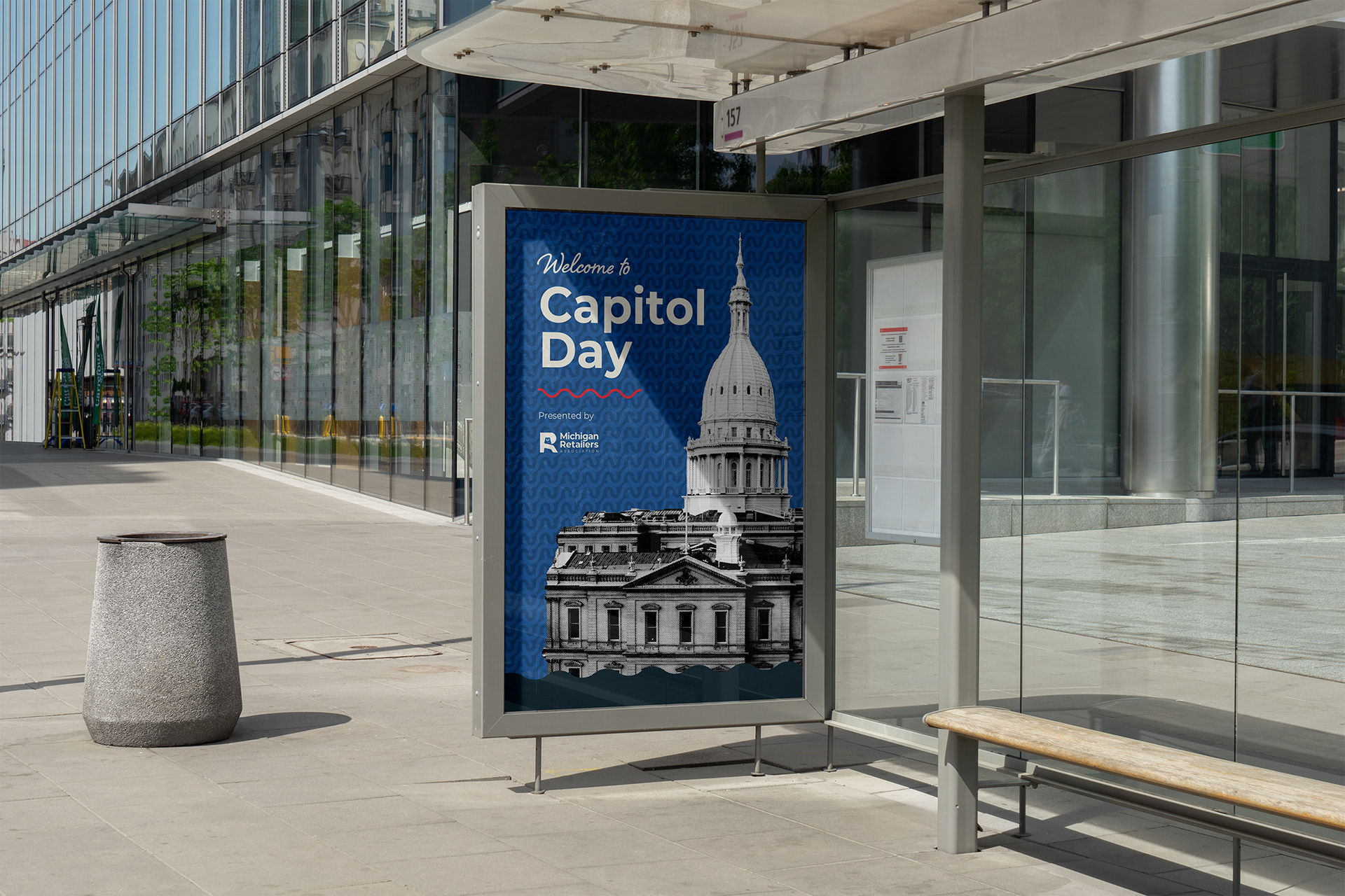
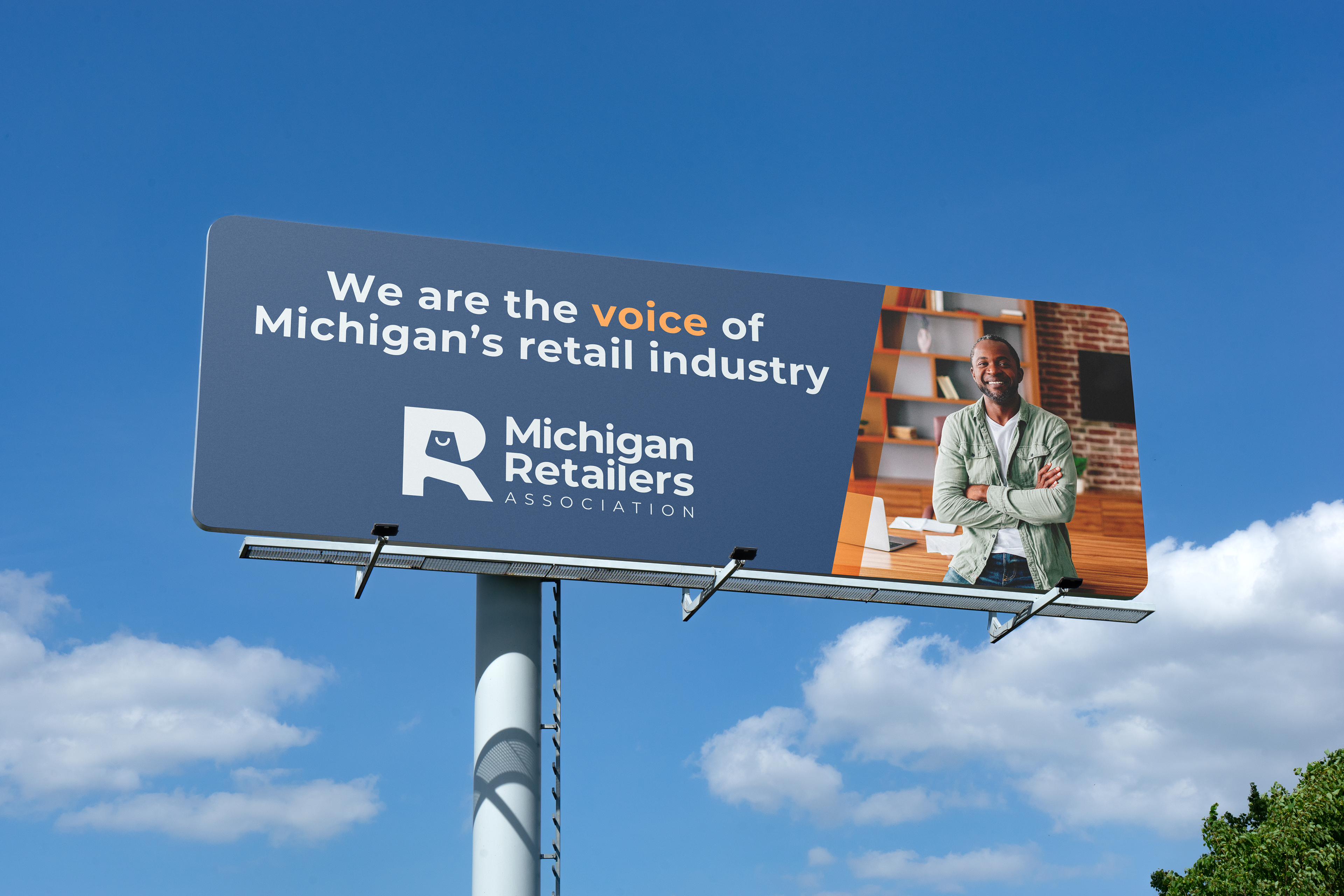
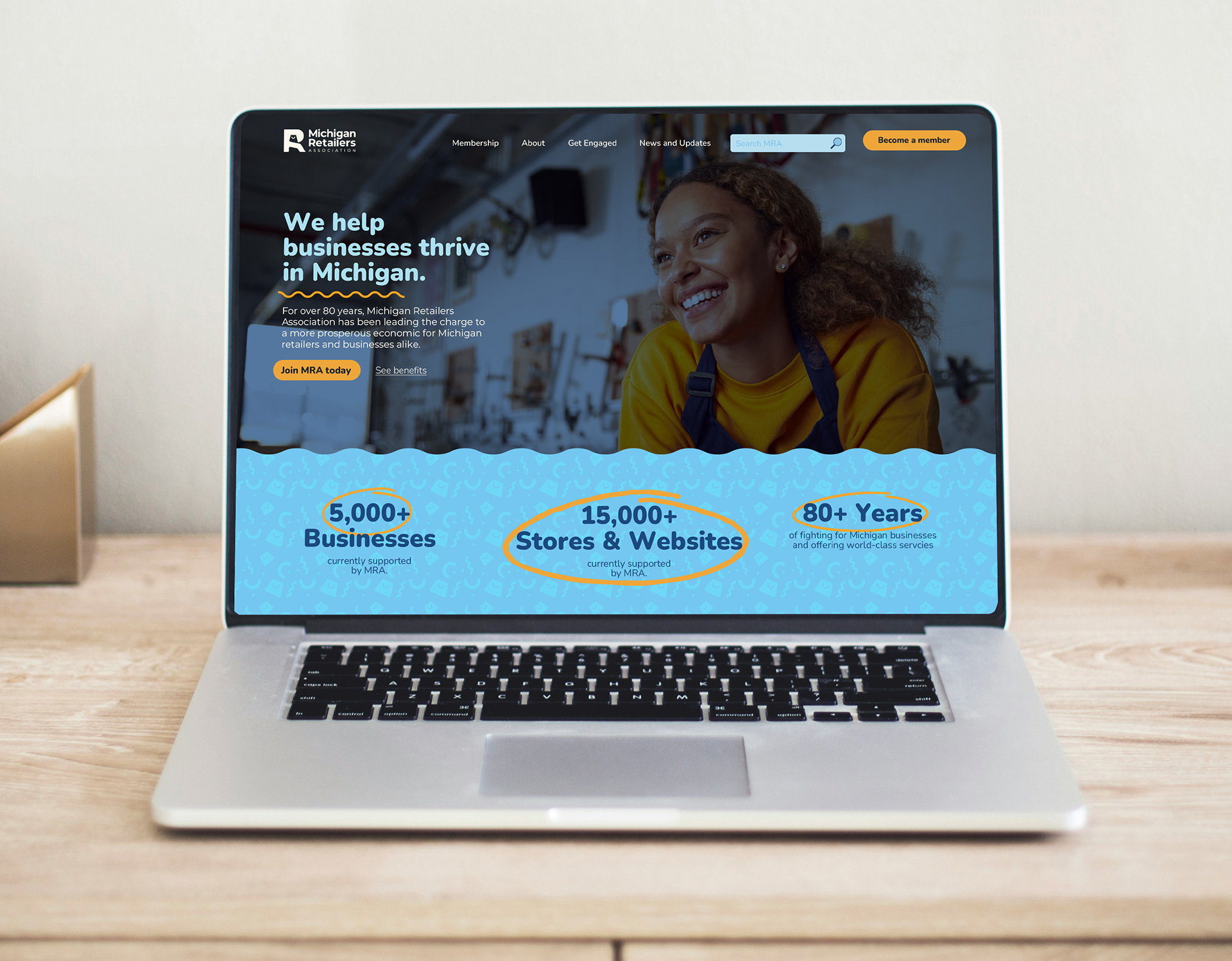
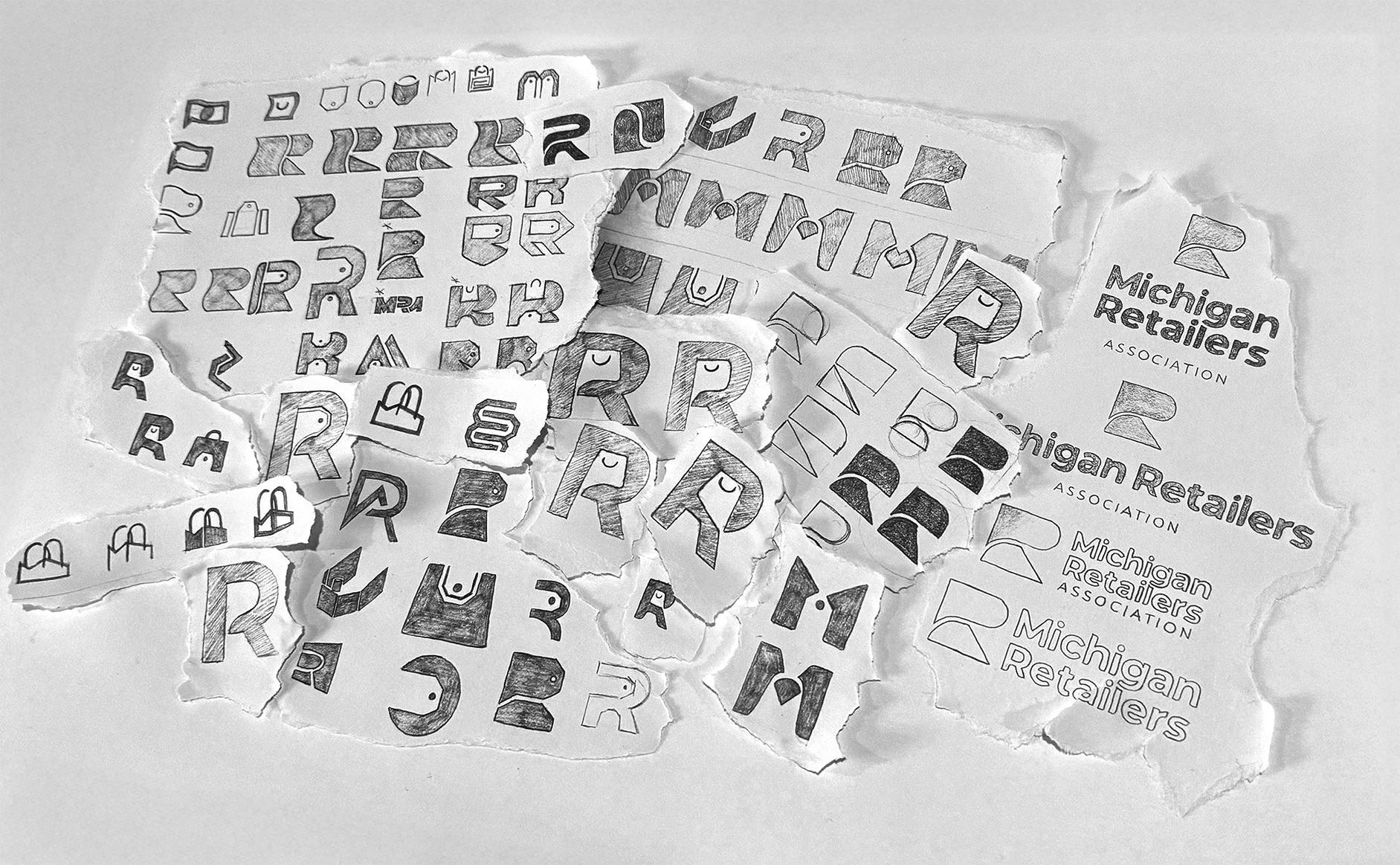
Making MRA's visual identity a reality
This project presented the challenge of unifying a multidisciplinary association with one unique brandmark. The retail industry is evolving, and it was time for MRA to do the same. The goal was to design a visual identity that spoke to a new generation of business owners while maintaining the core values that have made the Michigan Retailers Association an industry leader.
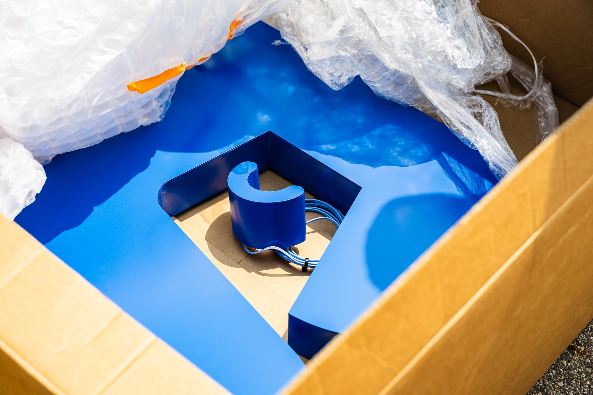
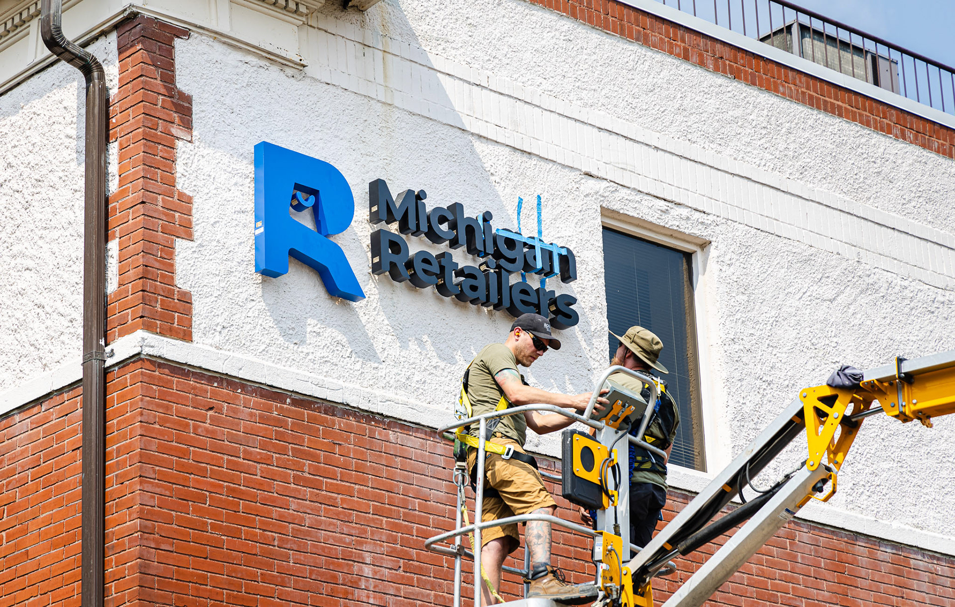

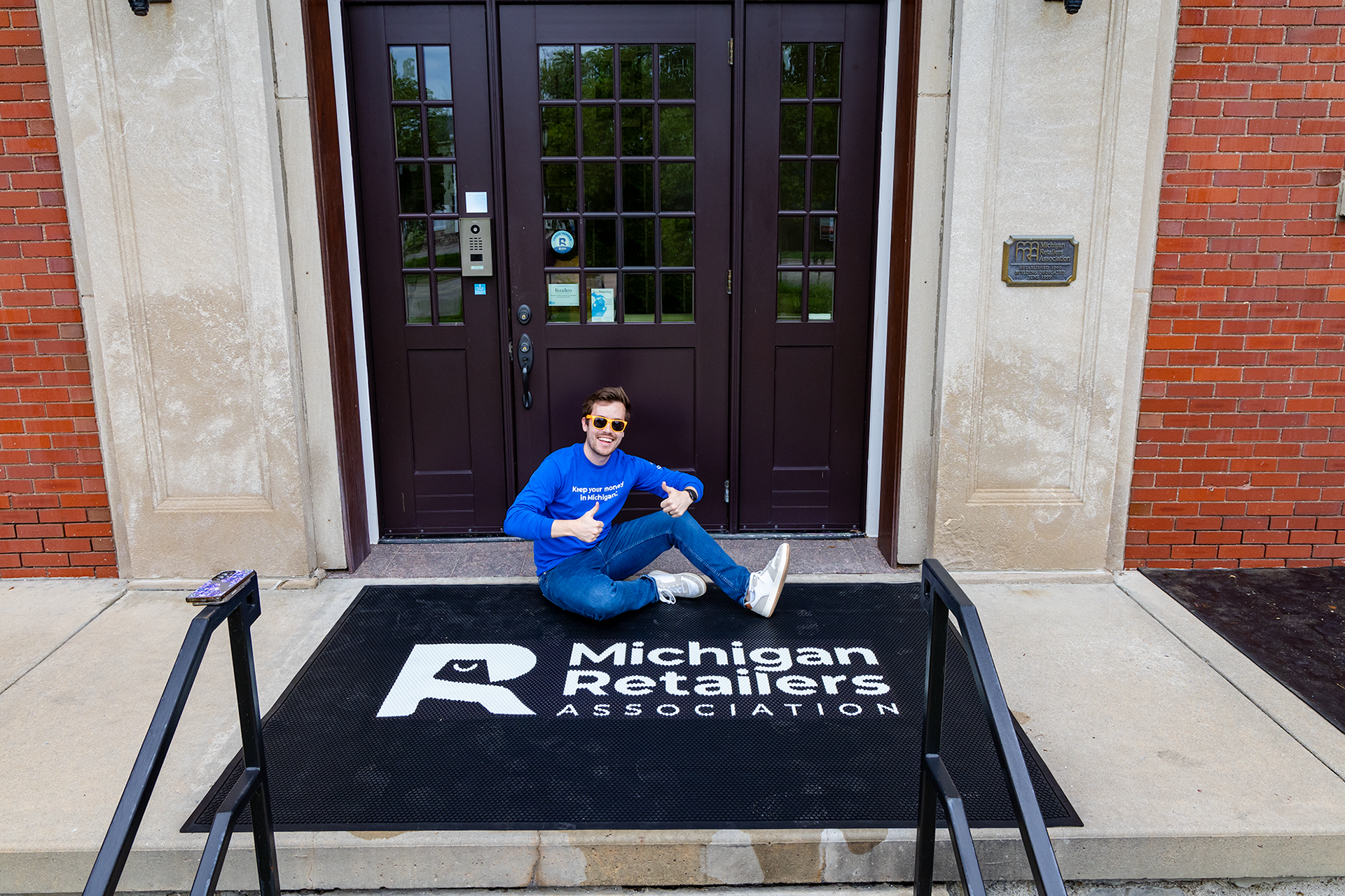
I had the opportunity to take a sledgehammer to our old concrete sign